- Like for the legacy API, graphical interfaces can be built with the Jetpack Compose API by combining layouts.
- A tree of layouts can be defined with a declarative fashion.
- Composition of layouts can be previewed directly in Android Studio without executing the application
Common graphical modifiers
- Most graphical elements can be parameterized with chainable Modifiers
- Modifiers can be used on a node according to the nature of its parent node (scope)
- Most numerical values used by the compose API are expressed as Float (practical for numerical computation)
- An exhaustive list of modifiers is available in the documentation
- Here are some useful modifiers that can be used to modify the apperance of an element (and available in most scopes):
Box(modifier = Modifier
  .fillMaxWidth() // to claim all the available width of the parent
  .fillMaxHeight() // to claim all the available height of the parent
  .fillMaxSize() // to claim all the space (width and height) of the parent
  .size(width=50.dp, height=100.dp) // to set the prefered size of the element
  .sizeIn(minWidth=10.dp, minHeight: 10.dp, maxWidth: 20.dp, maxHeight: 20.dp) // to set the min and max size for the two dimensions
  .width(50.dp).height(100.dp) // to set only the size on a single dimension
  .requiredSize(width=50.dp, height=100.dp) // to set the required size (that is enforced even if the constraints are against it)
  .offset(x=10.dp, y=20.dp) // to offset the position on the parent (increment or decrement position on horizontal/vertical axis)
  .absoluteOffset(x=10.dp, y=20.dp) // to offset the position without considering the writing orientation (positive x means offset to the right even in RTL mode)
  .zIndex(10f) // to set a position on the z axis
  .padding(all=10.dp) // to set an internal padding of the element
  .padding(horizontal=10.dp, vertical=20.dp) // to set different horizontal and vertical paddings
  .padding(start=10.dp, top=5.dp, end=7.dp, bottom=9.dp) // to set different paddings for the 4 corners
  .rotate(degrees=90) // rotate the element
  .scale(scale=2f) // scale the element
  .scale(scaleX=2f, scaleY=1f) // scale the element using different factors on horizontal and vertical axis
  .alpha(0.2) // apply an alpha value (transparency of the element)
  .background(color=Color.Red) // apply a color in the background
  .clip(shape=CircleShape) // cut the element using a shape
  ...
- The order of modifiers are important: the modifiers are applied from the left to the right
- They may be used several times
- It is possible to create our own modifiers; there are different kinds of modifiers like the LayoutModifier (see this page for further information) that modifies the measure of the component on which it is applied
Exemple: let's display a text with different borders separated by paddings
@Composable
    fun SuperBorderedText(text: String, modifier: Modifier = Modifier) {
        Text(text=text, modifier=modifier
            .border(width=2.dp, color= Color.Black)
            .padding(2.dp)
            .border(width=4.dp, color=Color.Yellow)
            .padding(4.dp)
            .border(width=8.dp, color=Color.Blue)
            .padding(20.dp)
        )
    }
☞ Some modifiers (not discussed on this page, but here) can also have other roles than modifying the layout or appearance like adding input interactions (to capture click or other touch events for example).
Size and position of an element on a layout
The responsibility of a layout is to attribute a size to all its children and to place them on a 2D space.
This task is done in several steps:
-
Measure all the children, i.e. their wanted size, using the measure method (return a Placeable with the dimensions and possibly wished offsets) ; Contraints with minimal and maximal dimensions are given to the measure method
- The layout task is recursively done for the children
- According to the dimensions of the children, the layout can decide its own size (but it can also decide to use the maximal size granted by the constraints)
- The layout places all its children respecting their dimensions
- The layout can return to its parent its size
☞ By default a layout has a policy looking alike the wrap_content policy of the legacy View API. It means that only the required space to show the content will be used (for example a Column containing two Text() nodes displaying each a line of text will adopt a global height that is the height required to display two lines of text. However this default behavior can be modified with Modifiers that alter the natural layout of nodes (like Modifier.fillMaxHeight() to consume all the height allowed to the parent).
⚠ There is an exception to the general process to manage layout measures, more deeply treated in the intrinsics section:
- Jetpack Compose forbids several measures for a given node (for performance reasons)
- However it exists a kind of "pre-measure" to get intrinsic min/max width and height (a node declares their prefered min and max dimensions)
- Then the layout can order a measure of each child deciding to opt for customized constraints (to adapt all the siblings to the size of the tallest component for example)
Different layouts can bse used and organized in a tree of layouts to display graphical components:
- One can use predefined layouts (Box, Column, Row...)
- Or create our own layout
Example: we create a layout to display all the children elements following a fractal fashion (we divide the height in two rows, we divide the second row in two colons... and so one recursively).
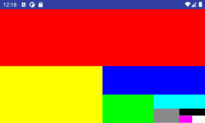
fun computeFractalPositions(left: Float, top: Float, right: Float, bottom: Float, number: Int, row: Boolean = false): List<RectF> {
        return when {
            number == 0 -> listOf()
            row -> {
                listOf(RectF(left, top, (left+right)/2, bottom)) +
                        computeFractalPositions((left+right)/2, top, right, bottom, number-1, !row)
            }
            else -> {
                listOf(RectF(left, top, right, (top+bottom)/2)) +
                        computeFractalPositions(left, (top+bottom)/2, right, bottom, number-1, !row)
            }
        }

    }
    /**
     * A layout that is a container splitting the space in two rows of equal height,
     * then splitting the second row to two colons of equal height,
     * then splitting the second colon of the previous row to two rows,
     * and so on to display all the the children
     */
    @Composable
    fun FractalLayout(
        modifier: Modifier = Modifier,
        content: @Composable () -> Unit
    ) {
        Layout(
            modifier = modifier,
            content = content
        ) { measurables, constraints ->
            val positions = computeFractalPositions(0f, 0f,
                constraints.maxWidth.toFloat(), constraints.maxHeight.toFloat(), measurables.size)

            val placeables = measurables.mapIndexed { index, measurable ->
                // Measure each children
                measurable.measure(Constraints.fixed(
                        positions[index].width().toInt(), positions[index].height().toInt()))
            }
            // Set the size of the layout as big as it can
            layout(constraints.maxWidth, constraints.maxHeight) {
                // Place children in the parent layout
                placeables.forEachIndexed { index, placeable ->
                    // Position item on the screen
                    placeable.placeRelative(positions[index].left.toInt(),
                        positions[index].top.toInt()
                    )
                }
            }
        }
    }
Box block
- The Box block defines a space where elements are stacked one on each other
- The Box block is the counterpart of the FrameLayout of the legacy API
- First declared element is at the deepest layer, last element at the most superficial layer
- The z-level of a child element can be changed with the modifier Modifier.zIndex(Float)
- The horizontal and vertical alignment of a child element (gravity) can be defined with Modifier.align(Alignement.{Top,Center,Bottom}{Start,Center,End}
Example: an image under several layers with semi-transparent colors; the slider is used to change the z-index of the image to push it to the front of the other elements.
const val ALPHA_VALUE = 0.25f
    val BOX_COLORS = arrayOf(Color.Red, Color.Green, Color.Blue, Color.Yellow).map { it.copy(alpha = ALPHA_VALUE) }


    /** Display a card with an image at the bottom with layers of colors
     *  A slider can be used to change the z-index of the image to put it to the front
     */
    @Composable
    fun MultiLayeredBox(imageResource: Int) {
        var imageZIndex by remember { mutableStateOf(0f) }
        Box(modifier = Modifier.fillMaxSize()) {
            Image(modifier = Modifier.zIndex(imageZIndex).align(alignment = Alignment.Center), painter = painterResource(imageResource), contentDescription = "A beautiful image")
            BOX_COLORS.forEachIndexed { index, color ->
                Box(modifier = Modifier
                    .zIndex(index.toFloat() / BOX_COLORS.size)
                    .fillMaxSize()
                    .background(color = color)) {
                    Text(modifier = Modifier.offset(y = (index * 20).dp), text="Layer ${index}")
                }
            }
            Slider(modifier = Modifier.zIndex(2f).align(Alignment.BottomCenter), value = imageZIndex, onValueChange = { imageZIndex = it })
        }
    }
Row and Column blocks
- Row and Column blocks group child elements into a box aligned on an horizontal or vertical axis
- Row and Column are the counterpart of the LinearLayout (with horizontal or vertical orientation) of the legacy API
- All the elements are placed on the Row/Colum according to their prefered size (size required to display the content) unless otherwise specified with a Modifier on the element
- They can be combined to create tables (a Row containing Columns)
- Like for a LinearLayout, a weight (e.g. Modifier.weight(0.5f, fill=true)) can be used on children to distribute the free space; the fill option allows the element to occupy all the space (even it is greater than its prefered size)
- {horizontal,vertical}Arragement parameter is used to specify the way elements are placed along the main axis
- {vertical,horizontal}Alignement parameter is used to specify how the elements must be positioned on the transversal axis
@Composable
inline fun Row(
    modifier: Modifier? = Modifier,
    horizontalArrangement: Arrangement.Horizontal? = Arrangement.Start,
    verticalAlignment: Alignment.Vertical? = Alignment.Top,
    content: (@Composable @ExtensionFunctionType RowScope.() -> Unit)?
): Unit

@Composable
inline fun Column(
    modifier: Modifier? = Modifier,
    verticalArrangement: Arrangement.Vertical? = Arrangement.Top,
    horizontalAlignment: Alignment.Horizontal? = Alignment.Start,
    content: (@Composable @ExtensionFunctionType ColumnScope.() -> Unit)?
): Unit
Example #1: let's draw the flag of Madagascar with the following elements
-
A Row filling all the space of the parent and containing:
- a Box with a white background (left white strip on 1/3 of the width)
- a Column to display the two horizontal stripes (red and green of equal height)

@Composable
    fun MadagascarFlag() {
        Row(modifier=Modifier.fillMaxSize().border(width=Dp.Hairline, color=Color.Black)) {
            Box(Modifier.fillMaxHeight().background(color=Color.White).weight(1f/3f, fill=true)) {  }
            Column(Modifier.fillMaxHeight().weight(2f/3f, fill=true)) {
                Box(Modifier.fillMaxWidth().background(color=Color.Red).weight(1f/2f, fill=true)) {}
                Box(Modifier.fillMaxWidth().background(color=Color.Green).weight(1f/2f, fill=true)) {}
            }
        }
    }
Example #2: it the turn to the flag of Czech Republic to be drawn; it is a littlemore complex than the flag of Madagascar since we must draw a triangular shape. Here are the layouts we will use:
-
A Box to superpose two layouts:
- a Column containing two Box for the two horizontal white and red strips
- a Row with a first element blue strip and a transparent strip; we use a shape to clip the first strip to a triangle
@Composable
    fun CzechFlag() {
        val triangleShape = GenericShape { size, layoutDirection ->
            moveTo(0f, 0f)
            lineTo(size.width, size.height / 2)
            lineTo(0f, size.height)
            lineTo(0f, 0f)
            close()
        }
        Box(modifier=Modifier.fillMaxSize().border(width=Dp.Hairline, color=Color.Black)) {
            Column(Modifier.fillMaxSize()) {
                Box(Modifier.fillMaxWidth().weight(1f/2f, fill=true).background(color=Color.White))
                Box(Modifier.fillMaxWidth().weight(1f/2f, fill=true).background(color=Color.Red))
            }
            Row(Modifier.fillMaxSize()) {
                Box(Modifier.fillMaxHeight().weight(1f/2f, fill=true).background(color=Color.Blue, shape=triangleShape))
                Box(Modifier.fillMaxHeight().weight(1f/2f, fill=true).background(color=Color.Transparent))
            }
        }
    }
Card blocks
- A Card can be used to group elements related to an entity with distinctive borders and elevation (useful to delimitate each item in a list of items).
- It is equivalent to CardView from the legacy API
@Composable
fun Card(
    modifier: Modifier = Modifier,
    shape: Shape = MaterialTheme.shapes.medium,
    backgroundColor: Color = MaterialTheme.colors.surface,
    contentColor: Color = contentColorFor(backgroundColor),
    border: BorderStroke? = null,
    elevation: Dp = 1.dp,
    content: @Composable () -> Unit
)
BoxWithConstraints
- BoxWithConstraints allows to know in its scope information about maximal allowed dimensions for the content
- maxWidth and maxHeight are the maximal usable dimensions
- It is practical for responsive rendering: for example one can display some items on one row in landscape mode or several rows in portrait mode
Example: displaying a grid of numbers on several raws; each number is placed on a card of width 100dp, the number of card by rows is determined with the help of BoxWithConstraints.
@Composable
    fun NumberCard(number: Int) {
        Card(modifier=Modifier.size(100.dp)) {
            Text(modifier=Modifier.fillMaxWidth(), text="$number", textAlign = TextAlign.Center)
        }
    }

    @Composable
    fun NumberGrid(range: IntRange) {
        BoxWithConstraints() {
            val numberByRow = maxWidth.div(100.dp).toInt()
            val scrollState = rememberScrollState()
            Column(modifier = Modifier.fillMaxWidth().verticalScroll(scrollState).background(Color.Red)) {
                range.chunked(numberByRow).forEach { elements ->
                    Row(modifier = Modifier.fillMaxWidth(), horizontalArrangement = SpaceAround) {
                        elements.forEach { NumberCard(it) }
                    }
                }
            }
        }
    }
Layout helpers and intrinsics
Some graphical elements may help to design layouts :
- The Spacer is an empty element that fills space in a layout
- The Divider is an element displaying a line to mark a frontier between elements
- Most of the time these helper elements must occupy a size on the layout linked to the size of their brothers.
- It is a problem since each child of a layout is independentely measured: the measure of a child does not depend on its siblings, only on the min and max size imposed by the constraints of its parent layout
- To overcome this limitation, intrinsics are introduced: before officially measuring a child, one can ask for its prefered size (a kind of pre-measure)
- When the height or width of a layout must be the tallest minimal intrinsic height or width of its children, one use modifier.height(IntrinsicSize.Min) or Modifier.width(IntrinsicSize.Min); therefore the layout will use constraints adapted to the minimun size of the tallest child to measure all the children (no child will be largest than this size).
- ⚠ Intrinsics cannot be used when the children contain a BoxWithConstraints or a lazy element.s
Example: a composable that display a text and below the same text rotated by 180 degrees and separated with a divider. If we use IntrinsicSize.Min, the minimal size of each Text composable is adapted to display the longest word; if we use IntrinsicSize.Max, the intrinsic width of the Text is computed to display the text on one line.
/** Display a text with a version rotated by 180 degrees.
     *  Inspired from the example at: https://developer.android.com/jetpack/compose/layouts/intrinsic-measurements#intrinsics-in-action
     */
    @Composable
    fun MirroredText(
        text: String,
        max: Boolean,
        modifier: Modifier = Modifier
    ) {
        Column(modifier = modifier.width(if (max) IntrinsicSize.Max else IntrinsicSize.Min)) {
            Text(modifier = Modifier.padding(4.dp), text=text)
            Divider(color = Color.Black, modifier = Modifier.fillMaxWidth().width(1.dp))
            Text(modifier = Modifier.padding(4.dp).rotate(180f), text=text)
        }
    }
In this example, how is the layout process lead (we assume the Column component is the sole on the screen)?
- The root component asks the Column to measure itself communicating as max constraints the size of the app window
-
The instrinsics modifier of the Column shortcuts the measure process: it asks to each child of the layout (Text, Divider and Text) their (minimal or maximal) intrinsic width
- Texts answer with the length required to display at least one word (min intrinsic width) or the full line (max intrinsic width)
- Divider answers with a null min and max intrinsic size
- Therefore the adopted intrinsic width is the tallest of intrinsic width of the texts
-
Then the classical measure process can continue: the Column is measured with min-max constraints that are the intrinsic width (height is constrained only be the size of the parent window)
- The Column ask its measure to the first Text with a mandatory width
- Idem for the Divider
- Idem for the second Text
- The Column knows now the height of each child (the intrinsic width is already determined) and places the children
- The Column can return its size to its parent
Scrollability
Components can be made scrollable with modifiers:
- Modifier.verticalScroll(state)
- Modifier.horizontalScroll(state)
- The state is used to keep the current state of scrolling across recompositions
-
Programmatic scroll is possible with state.animateScrollTo(position)
- Like every action that modify a side, it must be wrapped in a LaunchedEffect block
- It is possible to nest scrolling elements one into another
- With Modifier.scrollable(...) one can receive scrolling events without modifying the view
- Further information are available in the documentation.
Example: we display on a grid (row with several columns) integers from 0 to N using different bases (one base by column). The columns are independently vertically scrollable and the row is horizontally scrollable.
@Composable
    fun NumberBaseScroll(n: Int, bases: Int) {
        val hScrollState = rememberScrollState()
        Row(Modifier.horizontalScroll(hScrollState)) {
            (2..bases).forEach { base ->
                val vScrollState = rememberScrollState()
                Column(Modifier.padding(5.dp).verticalScroll(vScrollState)) {
                    Text("Base $base")
                    (0..n).forEach { i ->
                        Text(i.toString(base))
                    }
                }
            }
        }
    }
LazyRow and LazyColumn
-
Displaying a list of elements can be done embedding elements in a Row or Column but if the list contain numerous elements, drawbacks can be expected:
- The Row or Column may overflow the screen and may require to be scrollable
- All the elements will be rendered even if they are not visible on the screen
-
We want to use a better version of Row and Column that:
- Is scrollable by default
- And composes and renders the elements on demand only when they are visible (therefore we could manage hundreds, thousands of elements without slowdowns
- The solution is to use LazyRow and LazyColumn (that is the equivalent of RecyclerView from the legacy API
- To display a grid of element, one can for example use items with a LazyColumn that are Row containing elements of fixed width or use the experimental LazyVerticalGrid
- Currently, LazyRow and LazyColumn do not support animations when an item is inserted, deleted or moved
- Elements on a LazyRow or LazyColumns can be displayed with items(listOfElements) { element -> ... }
- Other variant of items with the number of elements and a lambda computing each element with its index: items(numberOfElements) { index -> ...}
- An optional parameter key for items can be used to specify a lambda computing an identifiable key for each item; it is useful if the position of items can change (otherwise the default key is the position of the item)
- LazyRow or LazyColumn are recomposed when their scrolling state changes: they can be redimensionned if the new elements requires more or less space (unless the dimension is constraint by modifiers).
-
Elements can be spaced horizontally or vertically with:
- verticalArrangement = Arrangement.spacedBy(4.dp)
- horizontalArrangement = Arrangement.spacedBy(4.dp)
-
Scrolling state can be handled with the list state:
- We create the state: val listState = rememberLazyListState()
- We give it to LazyRow or LazyColumn: LazyRow(state = listState, ...) { ... }
- We can order programmatically the list to be scrolled to a position (example from the official documentation):
@Composable
fun MessageList(messages: List<Message>) {
    val listState = rememberLazyListState()
    // Remember a CoroutineScope to be able to launch
    val coroutineScope = rememberCoroutineScope()

    LazyColumn(state = listState) {
        // ...
    }

    ScrollToTopButton(
        onClick = {
            coroutineScope.launch {
                // Animate scroll to the first item
                listState.animateScrollToItem(index = 0)
            }
        }
    )
}
@Composable Unit
LazyColumn(
    modifier: Modifier?,
    state: LazyListState?,
    contentPadding: PaddingValues?, // padding around the edges of item, e.g.: PaddingValues(horizontal = 16.dp, vertical = 8.dp)
    reverseLayout: Boolean?,
    verticalArrangement: Arrangement.Vertical?, // spacing around each item, e.g.: Arrangement.spacedBy(4.dp)
    horizontalAlignment: Alignment.Horizontal?, // how the item must be placed horizontally, e.g.: Alignment.CenterHorizontally
    flingBehavior: FlingBehavior?,
    content: (@ExtensionFunctionType LazyListScope.() -> Unit)?
)

@Composable Unit
LazyRow(
    modifier: Modifier?,
    state: LazyListState?,
    contentPadding: PaddingValues?,
    reverseLayout: Boolean?,
    horizontalArrangement: Arrangement.Horizontal?,
    verticalAlignment: Alignment.Vertical?,
    flingBehavior: FlingBehavior?,
    content: (@ExtensionFunctionType LazyListScope.() -> Unit)?
)
Example: a list of number with their decomposition in prime factors; the prime number are colored with a yellow background. We use a Card for each number with an elevation to delimitate each item. A LazyRow is used to display the prime factors: it is horizontally scollable. The LazyColumn with the cards is vertically scrollable, the cards are rendered on demand when we scroll.
fun decompose(n: Long): List<Long> {
        val factors = mutableListOf<Long>()
        var a = n
        var divider = 2L
        while (divider * divider <= a) {
            if (a % divider == 0L) {
                factors.add(divider)
                a /= divider
            } else {
                divider = if (divider == 2L) 3L else divider + 2
            }
        }
        if (a != 1L) factors.add(a)
        return factors
    }

    @Composable
    fun Decomposition(l: List<Long>) {
        LazyRow() {
            items(l) {
                Text(modifier=Modifier.padding(end = 200.dp).border(1.dp, color= Color.Red).padding(5.dp), text="$it")
            }
        }
    }

    @Composable
    fun NumberCard(number: Long) {
        val decomposition = decompose(number)
        val isPrime = decomposition.size == 1
        Card(Modifier.padding(15.dp), elevation = 10.dp) {
            Column(Modifier.fillMaxWidth().background(color = if (isPrime) Color.Yellow else Color.White)) {
                Text(text="$number", fontSize = 30.sp)
                Spacer(modifier = Modifier.height(5.dp))
                Decomposition(decomposition)
            }
        }
    }

    @Composable
    fun NumberZoo(range: LongRange) {
        LazyColumn() {
            items(count = (range.last - range.first + 1).toInt(), key = {it - range.first}) {
                NumberCard(range.first + it)
            }
        }
    }
Grids
- LazyVerticalGrid allow to display lazy loaded items on a grid that is vertically scrollable.
- It is currently an experimental API (not stable, may change in the future).
- The usage is the same of a LazyColumn or LazyRow with items
-
The size of colums can be set with the cells parameter:
-
GridCells.Adaptive(minSize = 128.dp) can be used to specify the minimal size of a column; each column will have the same size
- Example: for a screen of width 70dp, if we use minSize=20.dp, there will be 3 columns, each of size 23.33dp.
- GridCells.Fixed(count = 4) can be used to specify the numbef of columns rather than the minimal size of a column
-
GridCells.Adaptive(minSize = 128.dp) can be used to specify the minimal size of a column; each column will have the same size
Example: a grid of desserts for the different versions of Android (that have been named with a dessert in the old times)
object DessertsGrid {
    private fun getDesserts(context: Context): List<String> {
        return context.assets.list("desserts")?.map { "desserts/${it}" } ?: listOf()
    }

    private fun Context.assetsToBitmap(path: String): ImageBitmap? {
        return try {
            with(assets.open(path)){
                BitmapFactory.decodeStream(this).asImageBitmap()
            }
        } catch (e: IOException) { null }
    }

    @Composable
    fun Dessert(assetPath: String) {
        val bitmap = LocalContext.current.assetsToBitmap(assetPath)
        Column(horizontalAlignment = Alignment.CenterHorizontally) {
            if (bitmap != null)
                Image(bitmap = bitmap, contentDescription = "Image for $assetPath")
            else
                Text("Cannot load $assetPath")
            Text("${assetPath.split("/").last()}", modifier = Modifier.fillMaxWidth(), textAlign = TextAlign.Center)
        }
    }

    @ExperimentalFoundationApi
    @Composable
    fun DessertsGrid() {
        val context = LocalContext.current
        var minSizeByCol by remember { mutableStateOf(50f) }
        val desserts by remember { mutableStateOf(getDesserts(context)) }
        Column() {
            Slider(value=minSizeByCol, valueRange = 5f..200f, onValueChange={ minSizeByCol = it})
            LazyVerticalGrid(columns = GridCells.Adaptive(minSize = minSizeByCol.dp), contentPadding = PaddingValues(5.dp)) {
                items(desserts) { Dessert(it) }
            }
        }
    }
}
ConstraintLayout
- ConstraintLayout in the compose system allows to layout elements by specifying positional contraints (like its counterpart in the legacy API)
- If ConstraintLayout was the layout of choice in the legacy API, it is not an essential layout for Jetpack Compose: it is only recommended if it warranty a better readability of the code. It is also useful when we deal with lazy elements for which we cannot use intrinsics (thus we can constraint for example the height of a LazyColumn to be the same than the height of another element). For other cases using nested Row and Column could achieve the same result of a ContraintLayout with no penalty performance.
- For further information about the ConstraintLayout, consult the official documentation.
Example: a calendar with selectable year using a LazyColumn and a selectable month with a LazyRow
@Composable
    fun Years(yearRange: IntRange, year: Int, onSelectedYear: (Int) -> Unit, modifier: Modifier = Modifier) {
        LazyColumn(modifier=modifier) {
            items(count = yearRange.last - yearRange.first) {
                val y = yearRange.first + it
                Text(modifier=Modifier.clickable {  onSelectedYear(y) }, text="$y", fontWeight = if (y == year) FontWeight.Bold else FontWeight.Normal)
            }
        }
    }

    private val MONTHS: Array<String> = DateFormatSymbols().months
    private val DAYS_OF_WEEK = DateFormatSymbols().shortWeekdays.toList().subList(1, 8).toImmutableList()

    @Composable
    fun Months(month: Int, onSelectedMonth: (Int) -> Unit, modifier: Modifier = Modifier) {
        LazyRow(modifier) {
            itemsIndexed(MONTHS) { index, item ->
                val m = index + 1
                Text(modifier= Modifier
                    .padding(5.dp)
                    .clickable { onSelectedMonth(index + 1) }, text="${MONTHS[index]}", fontWeight = if (month == m) FontWeight.Bold else FontWeight.Normal)
            }
        }
    }

    @Composable
    fun Month(date: LocalDate, modifier: Modifier = Modifier) {
        val d = date.withDayOfMonth(1)
        val weeks = IntArray(5 * 7) // a month can contain at most 5 different weeks
        val offset = d.dayOfWeek.value - 1
        Column(modifier) {
            // header with the names of the days of week
            Row(Modifier.fillMaxWidth()) {
                DAYS_OF_WEEK.forEachIndexed { index, _ -> Text(modifier=Modifier.weight(1f), text= DAYS_OF_WEEK[(index+8) % 7]) }
            }
            // days of the month
            (0 until 6).forEach { week ->
                val firstDayOfWeek = week * 7 - offset + 1
                if (firstDayOfWeek <= d.lengthOfMonth())
                    Row(Modifier.fillMaxWidth()) {
                        DAYS_OF_WEEK.forEachIndexed { dayIndex, _ ->
                            val day = firstDayOfWeek + dayIndex
                            if (day >= 1 && day <= d.lengthOfMonth())
                                Text(text="$day", modifier=Modifier.width(0.dp).weight(1f))
                            else
                                Text("", modifier=Modifier.width(0.dp).weight(1f))
                        }
                    }
            }
        }
    }


    @Composable
    fun ComposeCalendar(modifier: Modifier = Modifier) {
        val initialDate by remember { mutableStateOf(LocalDate.now()) }
        var date by remember { mutableStateOf(LocalDate.now()) }
        ConstraintLayout(modifier) {
            val (years, months, month) = createRefs()
            Years(initialDate.year-50..initialDate.year+50, date.year, { date = date.withYear(it) },
                modifier = Modifier.constrainAs(years) {
                    top.linkTo(months.top)
                    bottom.linkTo(month.bottom)
                    height = Dimension.fillToConstraints
                })
            Months(date.monthValue, { date = date.withMonth(it) }, modifier=Modifier.constrainAs(months) {
                top.linkTo(parent.top)
                start.linkTo(years.end, margin = 10.dp)
                end.linkTo(month.end)
                width = Dimension.fillToConstraints
            })
            Month(date, modifier=Modifier.constrainAs(month) {
                top.linkTo(months.bottom)
                start.linkTo(years.end, margin = 10.dp)
                end.linkTo(parent.end)
                width = Dimension.fillToConstraints
                height = Dimension.wrapContent
            })
        }
    }
Scaffold (material design layout structure)
- Jetpack Compose proposes a Scaffold component that help to build a screen following the material design guidelines.
-
The Scaffold component has several arguments to specify elements in slots that will be used to build the screen:
- The main content that is expressed using the trailing @Composable lambda
- A top bar can be defined: topBar = { TopAppBar { /* Top app bar content */ } } to display a top bar
- A bottom bar can be created: bottomBar = { BottomAppBar { /* Bottom app bar content */ } } to display a bar at the bottom of the screen
-
A floating button: floatingActionButton = { FloatingActionButton(onClick = { /* ... */ }) { /* FAB content */ } } (button that is put in the foreground above the main content at the bottom)
- The position of the floating button can be set like this: floatingActionButtonPosition = FabPosition.Center
- The floating button can also be merged with the bottom bar: isFloatingActionButtonDocked = true
-
A drawer can be created (side panel that is displayable or hidden with a swipe gesture): drawerContent = { Text("foobar") }
- The drawer can be programmatically handled with a scaffoldState
@Composable
public fun Scaffold(
    modifier: Modifier,
    scaffoldState: ScaffoldState,
    topBar: @Composable () → Unit,
    bottomBar: @Composable () → Unit,
    snackbarHost: @Composable (SnackbarHostState) → Unit,
    floatingActionButton: @Composable () → Unit,
    floatingActionButtonPosition: FabPosition,
    isFloatingActionButtonDocked: Boolean,
    drawerContent: @Composable() (ColumnScope.() → Unit)?,
    drawerGesturesEnabled: Boolean,
    drawerShape: Shape,
    drawerElevation: Dp,
    drawerBackgroundColor: Color,
    drawerContentColor: Color,
    drawerScrimColor: Color,
    backgroundColor: Color,
    contentColor: Color,
    content: @Composable (PaddingValues) → Unit
): Unit
Example: a scaffold layout displaying a top bar with a title, a navigation icon and two buttons to decrement or increment a counter; the value of the counter is displayed as the main content of the layout; a drawer can be displayed on the left to directly select a number (the drawer can be made visible with a swipe gesture, by clicking on the navigation icon on the top bar or using the floating button at the bottom right); a bottom bar is visible with a text field to enter the number with a keyboard.
@Composable
fun ScaffoldExample() {
    var number by remember { mutableStateOf(0) }
    val scaffoldState = rememberScaffoldState()
    val coroutineScope = rememberCoroutineScope()

    fun updateValue(n: Int) {
        number = n
        if (n == 10) {
            // display a toast when we hit 10
            coroutineScope.launch { // using the `coroutineScope` to `launch` showing the snackbar
                // taking the `snackbarHostState` from the attached `scaffoldState`
                val snackbarResult = scaffoldState.snackbarHostState.showSnackbar(
                    message = "The value reached 10",
                    actionLabel = "Decrement"
                )
                when (snackbarResult) {
                    SnackbarResult.Dismissed -> Log.d("ScaffoldExample", "Dismissed")
                    SnackbarResult.ActionPerformed -> updateValue(9)
                }
            }
        }
    }

    fun setDrawerOpenState(value: Boolean) {
        coroutineScope.launch {
            scaffoldState.drawerState.apply {
                if (value) open() else close()
            }
        }
    }

    Scaffold(
       scaffoldState = scaffoldState,
       topBar = {
           TopAppBar(
               title = { Text("A beautiful title") },
               navigationIcon = { IconButton(onClick = { setDrawerOpenState(!scaffoldState.drawerState.isOpen) }) {
                   Icon(painter = painterResource(id = R.drawable.ic_menu), contentDescription = "menu") } },
               actions = {
                   // some actions for the top bar
                   Button(onClick = { updateValue(number - 1) }) { Text("-") }
                   Button(onClick = { updateValue(number + 1)}) { Text("+") }
               })
       },
       bottomBar = {
           BottomAppBar() {
               Text("Edit:")
               TextField("$number", onValueChange = {  number = it.toIntOrNull() ?: 0 })
           }
       },
       drawerContent = {
           LazyColumn() {
               items(100) {
                   val v = it
                   Text("$v",
                       modifier=Modifier.clickable { updateValue(v); setDrawerOpenState(false)  },
                       fontWeight = if (v == number) FontWeight.Bold else FontWeight.Normal )
               }
           }
       },
       floatingActionButton = {
            ExtendedFloatingActionButton(
                text = { Text("drawer") },
                onClick = {
                    // invert the state
                    setDrawerOpenState(!scaffoldState.drawerState.isOpen)
                }
            )
        }
    ) {
        Box(modifier=Modifier.fillMaxSize()) {
            Box(modifier=Modifier.align(Alignment.Center)) { Text("$number", fontSize = 100.sp) }
        }
    }
}
- A special layout BackdropScaffold is proposed to implement a backdrop structure
- A backdrop allows to present on the screen two layers of content: a back layer that can be reduced to allow the front layer to be fully displayed on the screen
- For further information, read the documentation dedicated to the BackdropScaffold
Subcompose
Subcompose allows to do virtual rendering to evaluate the size of components. It is useful when the knowledge of the size of some components is required to organize the layout.
Example: we want to find the maximal width of a set of texts to use it to reserve the maximal width for all the Text components (for alignement)
@Composable
fun RenderMapWithSubcompose(map: Map<String, @Composable () -> Unit>) {
    SubcomposeLayout { constraints ->
        val keyWidths = map.keys.associateWith { key ->
            subcompose("subcompose_$key") {
                Text(key)
            }[0].measure(Constraints()).width.toDp()
        }
        val maxWidth = keyWidths.values.maxOrNull() ?: 0.dp
        val contentPlaceable = subcompose("content") {
            LazyColumn(Modifier.fillMaxWidth()) {
                items(map.entries.toList(), key = { it.key }) { entry ->
                        Row(Modifier.fillMaxWidth()) {
                            Text(modifier = Modifier.width(maxWidth), text = entry.key)
                            entry.value()
                        }
                }
            }
        }[0].measure(constraints)
        layout(contentPlaceable.width, contentPlaceable.height) {
            contentPlaceable.place(0, 0)
        }
    }
}

@Composable
fun DessertsTable() {
    val desserts = Dessert.loadAllDesserts(LocalContext.current, false)
    // must indicate the type since Kotlin does not seem to infer with the annotation
    val dessertsMap = desserts.associate<Dessert,String,@Composable () -> Unit>{
        it.name to @Composable {
            Image(it.getBitmap(LocalContext.current).asImageBitmap(), it.name)
        }
    }
    RenderMapWithSubcompose(dessertsMap)
}